If consumers can’t find what they’re looking for on your website, then they will likely go somewhere else. That’s why research-based navigation is crucial for your credit union website design. Based on some counterintuitive research findings, I’d guess you probably have credit cards in the wrong spot.
If you pick a credit union website at random, you’ll likely find their credit cards under “Loans” in the navigation. Technically, they are loan products, but a study shows that consumers don’t think of credit cards that way.
BloomCU, a credit union website design agency, teamed up with 12 credit unions to conduct a card sorting study with 300 consumers. (Basically, card sorting is a type of study where you get participants to help you organize the information of your website by sorting all of your products and services into groups.)
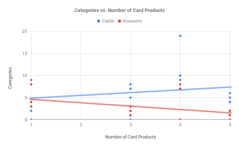
When organizing credit cards, the study participants put them under “Accounts” more often than “Loans,” but put them into a group called “Cards” even more frequently. Furthermore, the number of card products had by a single credit union impacted how the consumers sorted.

The card sorting data shows that consumers are more and more likely to put credit cards into a category called “Cards” as the number of card products per credit union increases.
For a credit union with only one or two cards, the participants sorted them into “Accounts” or “Cards” about evenly. But if a credit union had three or more, then they usually created a group just for “Cards.”
Takeaways: If you have one or two card items (including related services like CardValet), then put them into the “Accounts” section of your navigation. If you have three or more, then organize them into a new category called “Cards.”
Also read, “Noun-based labels make websites nearly twice as easy to navigate.”


