A credit union’s first responsibility is taking care of its members, which means you must create a well-rounded experience for them. Office design plays a more important role than you might think in fostering an inclusive culture. Let’s explore what office design says about your credit union and how you can create a better workspace for your members and employees.
Establishing Brand Identity
A well-defined brand identity is crucial for both staff and customers. When your employees know the company’s values and goals, they can work with a greater sense of purpose. They have the all-important “why” that every laborer needs to stay focused.
Similarly, when members understand and share your company’s principles, you can develop a deeper connection with them.
You can solidify your credit union’s identity by incorporating logos, slogans, color schemes, and artwork into your office’s design. These elements remind everyone in the building what your company stands for and encourage them to adopt the same mindset.
Showcasing Your Commitments
Along the lines of brand identity, your credit union’s physical location is a prime opportunity to visually demonstrate your commitment to community and/or charitable causes. Keeping the community in mind can help visitors remember your credit union as the local, member-driven organization it is.
For example, one of the increasingly essential parts of brand identity is environmental ethics. Consumers are more environmentally conscious than ever, and they want to engage with brands that have similar sentiments. You can make a green statement to your members with these design elements:
- Use renewable energy sources
- More natural lighting
- More greenery
- Water-saving bathroom fixtures
- Office supplies made from organic materials
- Second-hand office furniture
- Recycling and composting bins
Another part of brand identity is community engagement or sponsorship. Displaying community boards, photos and commemorations of community events and local artwork can all create a visually striking physical space that demonstrates your credit union’s values.
However you accomplish this, your office building should have its own personality that accurately reflects the company. Engaging and consistent design features will accomplish this goal and help your members and employees better identify with the company.
Improving Member Engagement
Credit unions want to foster feelings of safety and security in their members, and your office design should reflect those feelings. This design element has become even more critical in the last two years due to COVID-19.
You should rearrange your office to create ample space between groups of people and encourage employees to sanitize their workstations often. These practices demonstrate that you care about customer safety and will make at-risk members feel protected upon entering the building.
You can also add these design details to make clients feel safe and comfortable:
- Natural lighting
- Calming paint colors
- Wool rugs
- Heavy-curtained windows
- Soft seating arrangements
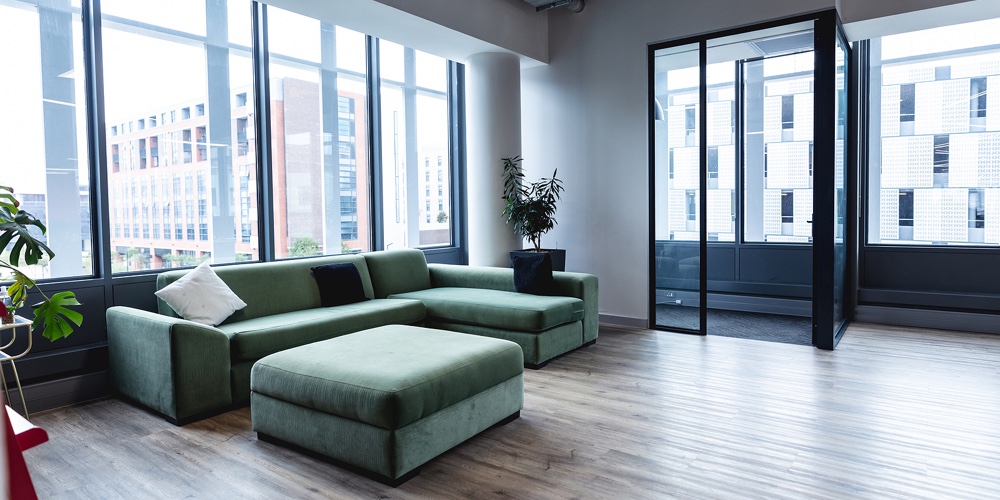
These features make your office more closely resemble a home than a workspace. A home-like office building with plenty of sunlight, soothing colors, and comfortable seating can make your engagements with clients more productive. The overlap with the eco-friendly design features we mentioned earlier is no coincidence: people like being in-tune with their environments.
Boosting Employee Productivity
Part of your job as a credit union leader is recognizing the needs of your employees. They need a workspace that allows them to collaborate and split off to do individual tasks. You can provide both settings with an accessible floor plan and designated quiet workrooms throughout the building.
Employees also want remote work accommodations. This new hybrid work environment is the future of the workforce, so you must adapt by establishing “workspace neighborhoods” throughout the office. A neighborhood is a group of desks and office furniture that can be rearranged to fit the preferences of people working on-site that day. The adjustments are worth the time and effort to make your staff more productive.
These neighborhoods should also be tech-centric spaces that enable remote workers and on-site workers to communicate. Make sure your office has these tools:
- Cloud computing technology that offers large-scale video conferencing
- Smart interactive whiteboards
- Quality cameras and microphones
- Meeting rooms with multiple screens for large conferences
Working at credit unions involves a lot of customer interaction, which can become an exhausting task as the day wears on. Your office design can help them stay energetic through several ways we’ve already discussed: more natural elements, a solid brand identity, and collaboration tools.
However, these elements can sometimes conflict with member satisfaction. For example, you might choose high-energy paint colors to help employee productivity, but the colors can make members feel uncomfortable. Workspace neighborhoods could prove successful for your workers, but members might not appreciate the constant change.
You can solve these problems by separating staff and client workspaces. Establish a group of rooms close to the main entrance for member engagement and leave the quieter parts of the building for employees.
Optimize Your Credit Union With a New Office Design
A business’s office building should make clients and employees happy. This task can be especially challenging for credit unions because of the delicate financial matters they discuss, but professionals must find solutions.
Your credit union’s office should have natural, soothing design elements and hybrid work accommodations that establish brand identity, promote member engagement, and boost employee productivity.


