When it comes to developing great user experiences, our minds often gravitate to power players such as Amazon, Uber, and Apple. But that doesn’t mean credit unions can’t leverage best practices in user experience to create engaging and compelling experiences that delight their members. Building great member experiences starts with knowing and understanding your member, their goals, motivations, and expectations. Mapping the member journey by using a journey map really helps you understand the path your members take to get to your products. It can help credit unions gain useful insights into how members move through the sales funnel, and it can help you identify gaps in the member experience—such as the experience of going from your home banking site to a loan payment site.
Phase One
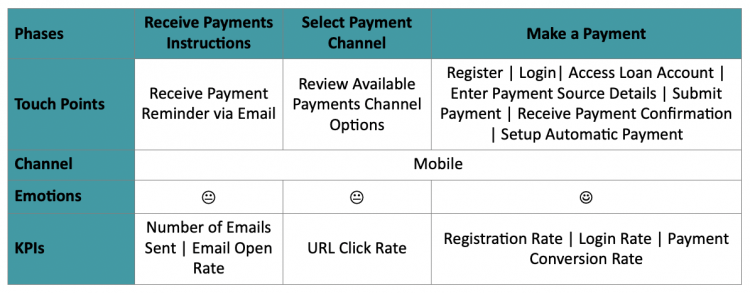
So, let's dive deeper into what a borrower's payment journey looks like for a loan payment. The user journey starts when a member receives their payment instructions from your institution. The channels your credit union can utilize to get this information into the hands of the borrower in this first touch point include paper mail, email, or just a simple text message. The goal here is to inform the borrower about their payment: the amount owed, the due date, and the available payment methods.
Phase Two
The next phase for the user is the payment method selection. This is where the borrower identifies and selects the best payment channel based on their payment preferences related to speed and convenience. The key here is to provide multiple payment channels that include self-serve, as well as staff-assisted when necessary to enable the payment. The goal is to provide your member with multiple channel options in order to lead to a positive member experience.
Phase Three
Finally, the last phase in the journey is when the member makes a payment. The borrower has been informed about the payment and has selected their payment channel of choice. Now they're ready to use their preferred channel to make their loan payment. Let's say the member chooses to use your self-serve web channel. There are multiple touch points they would experience when submitting a web payment, such as the app requiring the user to register their account or providing the option to use express pay. Having ACH and credit card payment method options, providing the ability to save the pay-from account details for future payments, and enabling auto pay are just some of the ways to make the payment process convenient, quick, and simple for your member.
A positive user experience in this final phase is extremely important to increase the payment conversion rate and make the member want to come back and utilize the same channel for future payments. Given the fact that 88% of users are less likely to visit a website again if they have a single bad experience on the website, it is critical that your credit union effectively manages the member experience. By placing certain restrictions—like forcing the user to register or not providing the ability to set up auto pay—could potentially decrease the payment conversion rate.
This highlights the importance of placing your members’ needs at the forefront of your product design. The journey map also allows you to understand what KPIs will be impacted at each phase of the member journey, and why certain metrics may be high or low. By overlaying the conversion rates at different touch points along the journey, we could pinpoint which touch points are performing well and which need to be reviewed for improvement.
It’s All About Emotion
Everything I just mentioned about the user journey really boils down to emotions. Emotional design, which focuses on creating delightful user experiences through human emotions, is a well-known concept in UX design.
When it comes to UX design, simply being creative is not enough to produce a positive user experience. Product leaders need to relate human emotions with how people respond to the experiences we create for them. The emotions our product generates at each stage of the user journey really dictates the success of our products. Do our products generate a rush of positive emotions that impact member satisfaction and conversion rate, or do they frustrate the user and negatively impact KPIs? Positive emotion is created when the member knows they have a loan payment due, and knows exactly what they need to do to access the payment app to make their payment.
Let’s look at a sample scenario with a fictitious borrower across the journey map:
Let’s say your member, we’ll call her Sarah, just bought a new car and needs to make her first loan payment online. She signs up for email payment reminders. Sarah will expect her payment detail information to be easily accessible, she’ll expect to be able to use her credit card to make a loan payment, and that she’ll be able to setup automatic payments and/or payment reminders.

At SWBC Payments, we take your member and staff user experiences very seriously. We are committed to providing your users with great payment experiences every time, which is why we invest time in understanding the user journey for our self-serve and staff-assistant payment channels. We understand that our payments experience is embedded in your members’ overall experience, which impacts your member satisfaction ratings. Click here to see our consumer-facing, self-serve payments portal in action.


