Some things in life—like walking, talking, and reading—are foundational. One of the first things you teach young children are their ABCs.
And one of the foundational elements of any credit union is its website. The website is even more foundational than physical branches at this point. The website is now the front porch. The first impression. The place members visit the most. It is also one of your most important marketing channels.
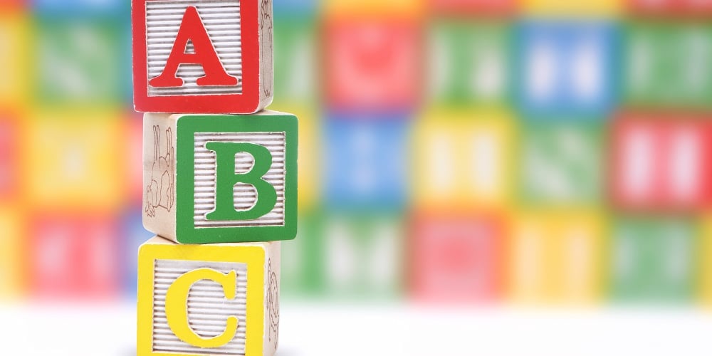
If your website is so foundational, what are its ABCs? Multiple credit union website redesigns and hundreds of website reviews as part of marketing assessments have revealed several keys to website success.
Here are the ABCs (or 26 fundamentals) to a great credit union website:
- A = Attractive—You have three seconds or less to make a good first impression. Design, visuals, and colors matter.
- B = Branded—Your site must communicate your credit union’s brand. Quickly show who your credit union serves and what makes your credit union different.
- C = Clarity—Donald Miller famously says, “If you confuse, you lose.” Nowhere is that more applicable than your website. Your products and services must be crystal clear.
- D = Deliberate—If you just throw a bunch of random messages on your site, it will look . . . well . . . random. The most successful sites are intentional in their messaging, their flow, and their user experience. What do you want your website to do?
- E = Engaging—Many financial institution websites are boring. And no one talks about a boring business. Make your site more active than passive with information consumers really want. It’s about them and not you.
- F = Fresh—When was the last time you updated your site? If the answer is longer than 24 or 36 months, then your site is quickly becoming outdated. Consumers, banking, and marketing are changing at too rapid a pace not to have a new look every few years.
- G = Grabs Attention—Your site needs to pop. It must be active and not static. Use motion graphics and animated GIFs rather than flat images.
- H = Helpful—People come to your site for information. This includes things like rate calculators, financial education, budget tips, and more.
- I = Identify with Your Brand—Your brand must connect with the right consumers. Remember, niches lead to riches. If your credit union is education based, use images and language on the website that resonate with educators.
- J = Judicious—Cut the copy. More than likely, your credit union website has too many words. People don’t read websites; they scan them. When it comes to the words on your site, less is best. Quickly fix excessive copy by using bullets, numbered lists, and more images.
- K = Knowledgeable—Your site must inform. Consumers today buy from experts. One of the keys with this letter, however, is not to lose members with too much information.
- L = Light—The average financial institution website is written at an 11th grade level. Yet, the average U.S. consumer reads at a 7th grade level. That is a massive gap! You need to lightly use industry jargon and verbiage.
- M = Marketing Messages—At the end of the day, your website must sell. That means you need marketing messages. Have calls to action and make your site more than just an online brochure.
- N = Neighborly—So many credit unions say they are about their community. Show that on your site. Rather than having generic images, use local photography to showcase your community involvement.
- O = Optimized—If your site is not SEO-friendly, potential members won’t find it. Ensure every page has H1/H2/H3 headings, meta descriptions, alt tags for images and internal links.
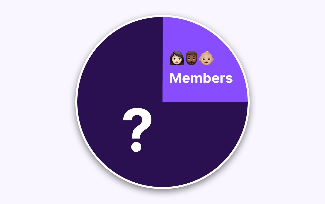
- P = Pictures of Members—Use your own members throughout your site. It makes you more relatable and humanizes your credit union.
- Q = Quotes from Members—Testimonials lend weight to your site. Some of your members absolutely love you. Tell their stories.
- R = Relevant—Your members and potential members have pain points. Rather than pushing your products and services, show how they solve the financial pain your members may be experiencing. In other words, be relevant to your members.
- S = Simple—Make your site easy to navigate. Some would argue the user experience is more important than any other aspect of your credit union website. Remember this principle: simplicity wins.
- U = Unique—Don’t look like every other financial institution website. As Earl Nightingale once famously said, “Don’t copy, create.” One of the worst things you can do is use a templated website.
- V = Video—As noted above, people are reading less and less. But they are watching more and more. Make sure you have videos (branded, member testimonials, educational, product, etc.) throughout your site. This letter comes with a caveat: don’t have so much video that it slows down your load times.
- W = Welcoming (to Non-Members)—More likely than not, a potential member will visit your credit union website long before they grace the doors of one your branches. How easy have you made it for them to join the credit union?
- X = X-acto—Like an X-acto knife, your site must have precisely what members want. In survey after survey, the top three things members visit credit union websites for are their routing number, online banking login and rates. Make sure all of those are easy to access.
- Y = Youthful—Almost every credit union today is still trying to get younger. Does your site appeal to Gen Z or is it more likely to attract their grandparents?
- Z = Zippy—Make sure your site loads fast. While you can’t control the members’ internet bandwidth, you can control how much clutter is on your site. Eliminate elements that increase load times.
One way to use these ABCs is as a checklist. You can go through all 26 letters and answer “yes” or “no” for each item as it relates to your credit union website. Or you can rate each of the above areas for your credit union on a scale of one (low) to ten (high)—and no 5s allowed!
The Alphabet Song ends with the line, “Now I Know My ABCs, Next Time Won’t You Sing With Me?”
Now that you know the ABCs of a great credit union website, hopefully your members will sing along with your brand.