Your website is one of your credit union’s most critical marketing workhorses—no surprise at a time when most consumers (71%) prefer to manage their financial accounts through digital channels.
But is it working as hard as it could be to deliver an experience that engages your visitors, improves their financial well-being, and boosts your bottom line, too?
Five simple questions can help your credit union get the most out of this vital investment.
1. Does your website pass the Swap Test?
Take any page from your website and imagine it without your credit union’s logo. Would you be able to recognize it as your website? And even more importantly, would your members recognize it as your website?
Too often, credit union websites feel a bit safe, bland, and highly interchangeable. Don’t settle for a “generic financial institution” approach—see your website as an opportunity to capture and convey your unique story. After all, your credit union’s website is the crown jewel of your marketing ecosystem and the most powerful, tangible expression of your brand.
For a powerful example of generic vs WOW, check out this before and after from PenAir Credit Union:
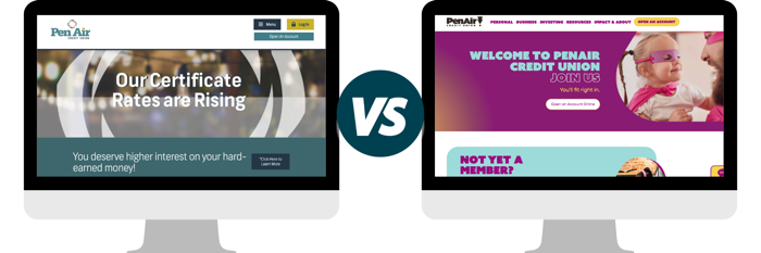
The example on the left is staid and ho-hum with a confusing image of … hmmm ... what is that exactly? There’s nothing especially welcoming or noteworthy about it. Then, take a look at the updated version. Now, everything from the whimsical imagery to the pops of color, the easy-to-find drop-downs to the typeface invites the site visitor in and conveys a sense of welcome and approachability.
Which website would you be more likely to linger on?
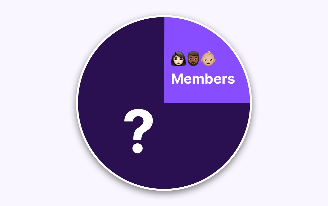
2. Do the people on our website look like our members?
Stock photos. We’ve all relied on them from time to time. After all, they’re easy and affordable and you can almost always find an image that’s more or less what you’re looking for.
But stock photos also tend to be generic and Instagram-perfect. Everyone’s living their calm, perfect, shiny nails and hair-perfectly-in-place best life. And doing things no one really does. Like smiling joyously in the middle of a room filled with moving boxes (recall your last moving day, and I’ll guess it didn’t quite match up). Or handing the keys to an expensive new car over to a deliriously happy teen (again, not a real moment for most of us).
Stock photos tend to capture an idealized vision of what a community is supposed to look like—the perfect mix of ages, genders and ethnicities—rather than your actual community.Research shows that stock photos don’t tend to add value and can even have a negative impact on the user experience. According to UX Myths:
Usability tests and eye-tracking studies show that stock photos and other decorative graphic elements rarely add value to a website and even less to a mobile app. They more often harm than improve the users’ experience.
Such images aren’t related to the topic of the website and don’t hold useful information. Users usually overlook stock images and might even get frustrated by them.
That doesn’t mean that imagery isn’t important, but it does mean that imagery should be relevant and authentic. While credit unions don’t offer products and services that require a vivid photo for the sale, we live in a visual culture and images shouldn’t be an afterthought.
Plus, stock photos only further the risk of a viewer confusing your credit union with another company, and the financial services industry is already one that struggles with differentiation. Which collection of photos below is more memorable?

The right hand collection features photos from DC Credit Union, Point West, Trailhead, and Abilene Teachers FCU. These are all small or midsize credit unions that have been intentional about prioritizing authentic photography. And yes, custom photography can be a bit pricey up front—but the cost of images that don’t tell your true brand story will be higher in the long-term.
See our previous CUInsight article, “Most credit union rebrands overlook this one crucial thing” for accessible ideas on how to level up your imagery, including examples from other credit unions.
3. Are we trying to sell too much too soon?
Some credit unions think of their websites first and foremost as vehicles to sell products.
It’s important to leverage this digital channel to increase account openings and loan volume. But you also need to tell your brand story!
Prospective members don’t always visit your site ready to open a checking account. Sometimes, they’re checking you out and trying to decide if it’s worth making the switch from their current financial institution. In fact, the perceived hassle of a switch is often behind the fact that, on average, U.S. adults have had their existing checking and savings accounts for 17 years. Prospective members want to be sold on your story and value proposition before taking that formidable leap. Compare this Wells Fargo homepage to the homepage of DC Credit Union:
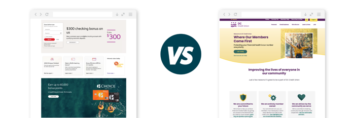
Yes, a prospect might join for a special offer, but will that help your credit union in the long run? A member who joins because they resonate with your values is far more likely to build a long-term relationship with your credit union, to have greater wallet share, and to promote your credit union through reviews and word-of-mouth, than a member who joins for a $300 checking bonus or because of a great rate.
We know it can be tricky to strike the right balance between telling your story and promoting products. We have a few tricks up our sleeve:
- Dual homepages:This functionality lets you deliver different versions of your homepage for prospects and members. The member version can be more product-centric—after all, members are already in a relationship with you and are more likely to cut to the chase on your current offers and promotions. Prospects want a little more time to build trust and get to know you.
- Login drop-downs:Most members come to your website to log into online banking. Promote your products where they’re most likely to see them by leveraging a dropdown when they click the “login” button, rather than cluttering up valuable above-the-fold real estate on your homepage.
- Onsite retargeting:Consider this scenario: You have a repeat visitor who’s already visited a landing page or product page about auto loans. The next time they visit, let them know you “see” them. Offer them a personalized homepage that features auto loans or promotes an auto loan offer.
4. Are we making website visitors think too much?
The number one rule of good user experience (UX): Don’t make me think!
We’ve all seen websites that look fancy and feature flashy technology but are annoyingly hard to navigate.
Most of the time, “boring” UX is the best UX. Boring is super straightforward. Boring gets the member exactly what they need. Boring gets the job done with the least number of steps and minimal confusion.
We know, we know, we marketers like to be creative. Users do appreciate a great-looking site, with nearly half of them assessing a site’s credibility based on visual design. But your members are also looking for speed and efficiency. They want what they want, and they want it NOW! Did you know that even a one-second delay in a page load can cause a 7% loss in conversions?
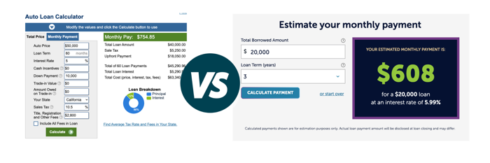
Compare these two calculators. Yes, the left hand calculator is going to give a visitor the most accurate monthly payment, and it could be a great financial education tool. But look at all the information the visitor needs to input!Most people won’t know the answers and won’t take the time to find them.
Now, consider the calculator on the right. If the goal is to get a ballpark estimate to help a visitor decide if they should pursue an auto loan with your credit union, the right hand calculator is a far more valuable tool. It integrates with your rates tables so that visitors only need to share two pieces of information to see if the monthly payment is within range. And prospects will have a rough answer to their questions in seconds.
And don’t just ask if you’re making visitors overthink. Ask the following too:
- Are we asking the right questions to get the visitor to the next step? Is there any information we can cut or any steps we can consolidate for fewer clicks?
- Is it clear and intuitive how to advance to the next step? Are we managing expectations as to what the visitor will find when they get there?
5. Why would anyone read our blog vs. other financial blogs?
Feeling frustrated that your website blogs don’t generate much traffic? Maybe it’s because there’s nothing unique about what your blog has to offer. We’ve seen firsthand that credit union blogs can be a powerful way to engage members and attract prospects with the right content.
Here’s a great example.
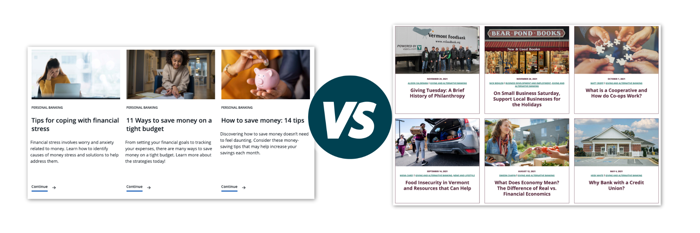
The blog on the left is from Wells Fargo. The blog on the right is from VSECU (soon to be EastRise). The Wells Fargo blog certainly has helpful content, but the topics are generic and could come from any financial institution. The VSECU blog posts, on the other hand, are specific to the community and to the credit union brand.
How can you achieve a personalized approach for your credit union? Consider the following:
- Bring a distinct voice to your blog. This could be a choice of style or tone, or you could establish a specific staffer as your resident expert.
- Offer financial education through the lens of member victories. For instance, ask a member how your credit union helped them conquer debt or find a loan when they had a rocky credit history. UW Credit Union and our client First Entertainment both do a great job leveraging this approach.
- Highlight local businesses and nonprofits. Illustrate how your credit union connects with and supports your community. This is also a great opportunity to spotlight your business clients if you offer business banking services.
- Highlight employee expertise in different departments. Build connections and strengthen your reputation by featuring specific employees and the problems they’ve helped members solve. Summit Credit Union shares a personal profile for each mortgage loan officer (MLO)—a tool that helps members pick an MLO that meshes with their needs.
It might seem intuitive that a flashy website with fancy tools and plenty of product promos will give you the biggest bang for your buck. But the reality is that the best way to increase your website’s ROI is by being true to your brand. Feature authentic photography. Offer a “boring” and streamlined user experience. Tell your story, your members’ stories, and your community’s stories.
We live in an industry where differentiation can be a challenge. Be yourself, and you’ll create a website that stands out from the crowd.
Is your credit union looking to redesign its website? At PixelSpoke, an employee-owned cooperative, we draw from our deep expertise in the credit union industry, UX/design best practices, and digital marketing trends to create easy-to-use, high-converting, award-winning websites. If you’re interested in learning more, feel free to reach out using the form below: