Credit unions have lots of products and services. While variety can be a good thing, sometimes your own products compete with each other.
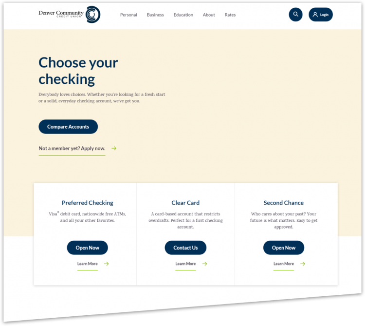
For example, Denver Community Credit Union has three checking products: Preferred Checking, Clear Card, and Second Chance Checking. They want to open more Preferred Checking accounts—their most important checking product—but their website was presenting all three options as equally important.

Denver Community CU’s website showed all three checking products as equally important on an “option page”.
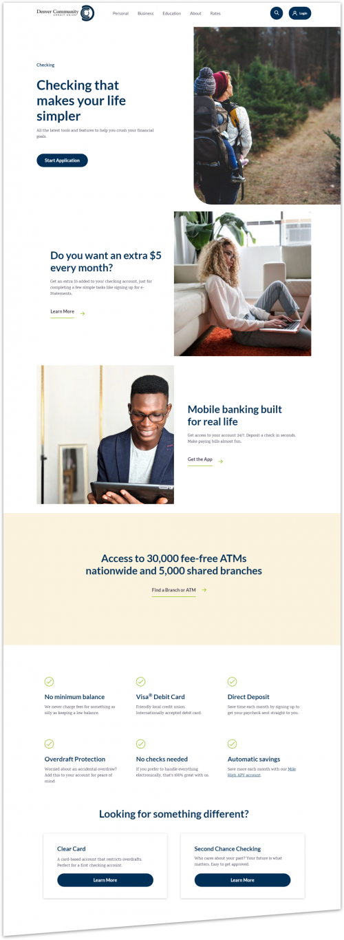
To attract more people to Preferred Checking, we decided to test what would happen if we made it the default choice. So, we created a new webpage experience. Rather than making you choose initially between the three options, instead you first see a page about Preferred Checking. The other two checking products are still available, but mentioned lower on the page under a heading that says, “Looking for something different?”

In the new experience, you first see a page about Preferred Checking instead of a choice between all three options.
We a/b tested the new experience against the original one to see which version generates more leads for Preferred Checking accounts. (A “lead” is generated when someone gives their name, email, and phone number to start an application for an account.)

We tested the original experience (“Funnel A” on top) against the new one (“Funnel B” on bottom) to see which generates more leads.
After a/b testing for a few weeks, we found that the new experience produced 68% more leads for Preferred Checking accounts (with a statistical confidence of 99.85%, which means you can trust the result). The new experience is a clear winner. So, if you have multiple products that compete with each other, you can get more of your best one by making it the default choice.
Takeaway
Make your best your default. When you have multiple competing products and you want people to sign up for one more than the others, make it the default choice.


