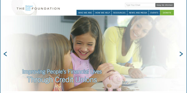
Are you redoing your website soon? Recently at the National Credit Union Foundation (the Foundation), we launched a new logo and website which was a process that took about eight months last year.
After finding the right company to work with on our new site (we ended up continuing to work with a local company, Acumium, who has hosted the Foundation’s website since the early 2000s), we spent the first few months digging into things such as:
- Current website challenges
- Goals and objectives of the new site
- Who is our target audience(s) and what do we want people to do on our site
- Design and content/navigation plan
That discovery process between Foundation leadership and Acumium was the most important and worthwhile exercise of the whole endeavor. With a strong blueprint, it made the following months much easier.
For example, one of our challenges was it used to be hard for users to find their contacts at state credit union foundations. On our old site, we just had a long laundry list of contact information, which is hard if you aren’t necessarily sure which state league or foundation you are associated with (or simply don’t like scrolling through a ton of irrelevant text). Through talking it through with Acumium we were able to build an interactive map that users can just click their state and find their state foundation contact easily.
Here some other lessons I learned in the redesign process:
- Content – I found that we had over 12 years’ worth of content on the site (mostly archived news stories) because we moved everything over in the last redesign. With such a mound of content, we found it much easier to just start the new site with a clean slate. That way it was built from the ground up with every piece of content curated for maximum effect.
- Navigation – With relation to content, this was very important. In the past our navigation and content was very internally-focused. With our new site, we made a conscious effort to design it from the user’s perspective. So whether you know a lot about the Foundation or very little, it’s now a lot easier to find what you are looking for.
- Search Engine Optimization (SEO) – Again, relating to creating all-new content,spending a lot of time on SEO was key so our website shows up high in user’s search engine results.For example,I spent many hours with Acumium coming up with appropriate key words related to the Foundation’s work, which was very helpful in the end to lay out the content in a SEO-rich way.
- Design – I was surprised at how helpful it was during the discovery phase to look at other websites for ideas and inspiration for our site design and navigation. I spent more time on that than I thought I would, but it was incredibly useful.
- Features – With web applications, it’s easy to go overboard and add erroneous features. That’s where the discovery process of going through goals and objectives really helped decide what was essential. For example, it was clear in our analytics that many people were visiting our site from smartphones, so including responsive design (which meant a mobile-based site) in our redesign plans was a no-brainer.
These are the big things that struck me the most. This is the third major redesign of a major website that I’ve been a part of, and there are always elements that are the same, but every project is different too based on goals, objectives, audiences, etc. I should also add that it was also really helpful to have others (re: non-Foundation staff) check the site out and give feedback prior to launch. I also even vetted the sitemap/navigation with non-Foundation folks before putting content in to ensure we were on the right track early on.
It’s a long and in-depth process, but worth it in the end for all involved. I’m sure many of you have gone through this process. What have you learned?


