Your credit union’s website continues to be one of your most impactful business tools, acting as a solid rock as trends fade in and out. And yet, marketing plans rarely include website improvements and content updates anymore. The focus is on social media, video, and SEO.[1]

But guess what? You can’t succeed in these areas without a powerful website as a foundation. Without it, your marketing activities are like a door with nothing behind it. And the only way to have a powerful website is to put critical focus on the customer journey, which is the actual experience a visitor has as they navigate your website. It’s a combination of content, layout, and psychology, and one of the most common mistakes I see among credit unions is that their websites lacks this methodology.
The good news is that creating a clear customer journey on your website doesn’t have to be hard.
In this article, I’ll discuss why hyper-focused and well-curated content is critical on your web pages and walk you through a proven framework for creating successful customer journeys. This framework will embolden your brand and strengthen your relationship with your membership and community. Let’s dive in.
What is a Customer Journey?
Think of a customer web journey as the stages of individual experience the customer has as they navigate your website, including your introduction, services, education, and calls-to-action. The most important part? The journey can't be rushed. A member services rep wouldn't rush to a visitor with a stack of loan paperwork as soon as they walked in the door, would they? Well, it's the same with your website.
Ask yourself:
- “What’s the very first thing they see when they visit my homepage?”
- “What am I telling them to do and what action to take?”
- “Is it obvious where they can educate themselves and learn more about why I am the best choice?” 70% of the buying process takes place before a customer ever reaches out.
Web design firms will sell you on the look and “feel” of the site, but I rarely see consideration for the content of the site. Your website needs to consider how each visitor will navigate through your page, ultimately leading up to the action you want them to take—whether that’s applying for a car loan or joining your credit union. Yes, that has to do with how the site looks, but even more to do with your site’s content.
Common Red Flags
So, how do you know if your credit union’s website is a victim of “all look and no substance?” Here are a few critical red flags:
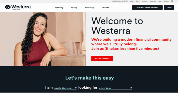
- Are there multiple competing CTAs (Calls To Action) as soon as they hit the page? Think: “Join now!” “Apply Now!” “Get Pre-approved here!” So many choices overwhelm your visitor and create a choice paralysis. Your login and contact buttons are fine in the upper right-hand corner, but you need to take a hard look at whether your webpages overwhelm. Westerra CU is a great example of giving just enough information “above the fold.”
- Do you lack any sort of unique credit union story? So many credit union “About us” pages say the exact same thing, nearly word for word. “Founded in 19XX, our goal is to provide our members with the very best financial tools...” This causes you to be forgettable and sink into a sea of sameness.
- Do you jump to conclusions that the visitor wants to do business with you before establishing why you’d be good for them? For example, does “Open a checking account here!” take them directly to the account opening portal? That’s a huge assumption that they are ready to proceed, and they aren’t just looking for information.
Customer Journey: The Six Components
The very best websites, regardless of industry or audience, are obvious as to their intent, communicate their unique value (basically, why should the visitor do business with them?), and leave the visitor feeling empowered, not frustrated. Accomplishing these three goals can be challenging, that’s why I created a drag-and-drop framework for organizations to build their customer journey wireframe.
Utilizing these six customer journey components for every webpage will help you create crystal clear web content that engages your visitor, and ultimately, drives marketing success. Let’s take a look.
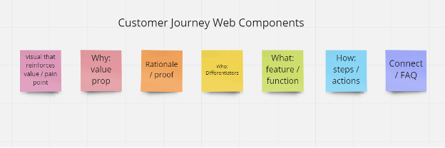
Using “who-what-why” question psychology, each of these six components answers the visitor’s questions in a methodical and natural way. The beauty of this framework is that it can be adjusted based on audience, content, action, and so much more; it’s completely accommodating to any type of customer journey and will look different for each of your core pages. For this exercise, we will focus on a homepage framework.
#1. Why: Value Proposition
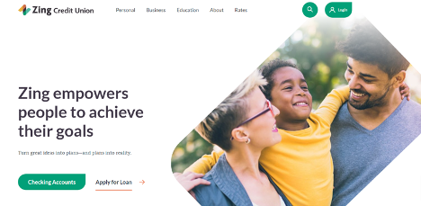
Right out of the gate, you should communicate your value proposition which, in a nutshell, answers why someone would do business with you. It uniquely explains what you do and what’s in it for them in a sentence or two. It’s the most important component of your brand identity and should hook your visitor right away. It should be bigger than a basic explanation of your services. Think something like: "We help you save for the moments that matter" vs "We are a trusted financial partner." Those two phrases feel very different.
Example - Zing CU
Example: Community First CU

#2. Rationale/Proof
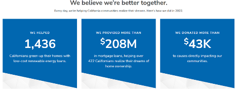
This section backs up your message in component #1: Value Proposition with primary source material, and it’s important that it immediately follows your “why” component. There are different types of proof methods, ranging from testimonials, to awards, to statistics. A combination of several works well in backing up your claims.
Example – Alliant CU

Example – BluPeak CU
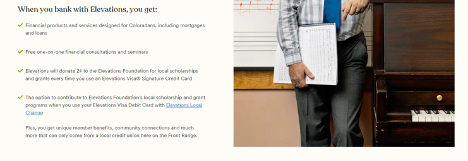
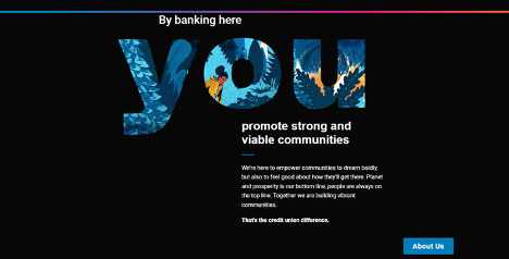
#3 Who: Differentiators
This component builds off component #1: value proposition and digs into who you are and how you are different—and better—than everyone else. At this point, the visitor has a sense of your personality and what makes you stand out. Now’s the time to double-down and tell your story.
This takes a lot of soul searching and a brand strategy can really help with identifying your differentiators. Most credit unions aren’t taking advantage of the enormous opportunities they have to share their differentiators—hence all the generic “about us” credit union pages. But more on that another time.
Example – Elevations CU
Example – Verity CU
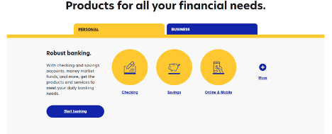
#4 What: Feature-Function
As we continue down the customer journey funnel, we start getting into more of the nitty-gritty details. You’ve already explained what makes you different—better—and backed it up with proof. The visitor has likely begun to trust you, and it’s time to talk about your products and services. See how different the experience is when you position yourself as trustworthy and capable before you start selling your products?
Example: Redwood CU

Example: Ent
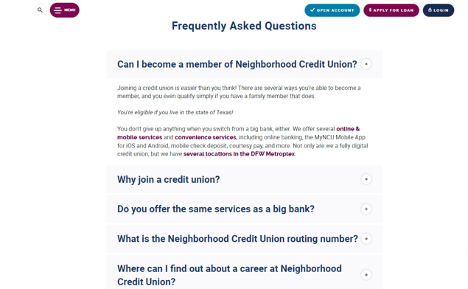
#5 How: Steps & Actions, and #6: FAQ
These components expand on #4: Feature-Function. If your web visitor has made it this far down your page, it’s obvious they are interested in doing business with your credit union. This is where you've earned the right to educate more about your services. Offer them additional details on your services and your organization— like interest rates, technical features, and FAQs—so they don’t have to go searching for them.
Example: A+ FCU

Example: Neighborhood CU
Your Website Framework: A Real Example
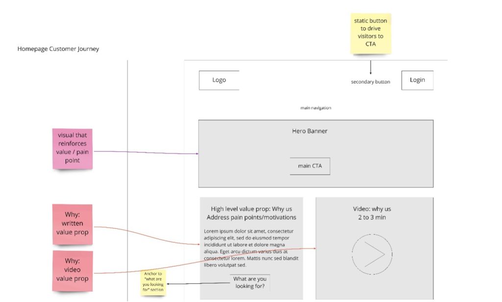
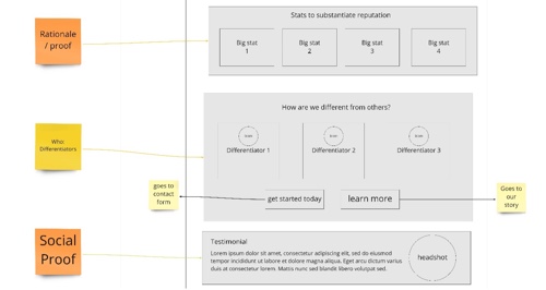
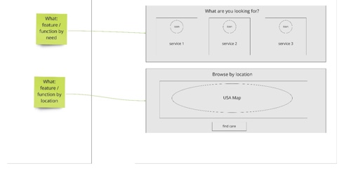
Now that you have an idea of how the six customer journey components work, let’s pull up an actual customer journey wireframe. You’ll see how these components can be used as you brainstorm and plan out your website’s content.
Top section
You’ll see a series of value props here, both in written and video form. The banner you use should reinforce your value prop, either literally or abstractly. Make sure it’s different and not the same old stock photos every other credit union uses.
Middle section
This section reinforces your brand values and what makes you different and provides two unique sections to back up your claims in the form of (1) statistics and (2) testimonials. Different types of proof points resonate with some customers more than others, so including a variety covers your bases.
Bottom section
We now get into the product and service details, information that would have seemed presumptive too early on in the page. I’ve included a map for this example, but FAQs or any variety of interactive, educational content would work great here.
Conclusion
I hope you found this article equally inspiriting and helpful as you begin planning your webpage updates for your credit union. What can seem overwhelming can be achieved with methodical, rational thinking. If ever in doubt about your customer journey experience, just go back to the basics. The framework is a great place to start.
[1] https://blog.hubspot.com/marketing/marketing-trends


