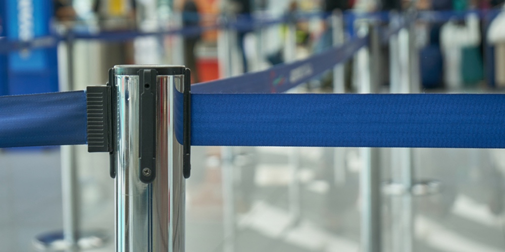
Cattle ropes. Stanchions. Retractable barriers.
Whatever you call them, the first images that come to mind are red carpets and waiting lines … or bank branches from the 1990s.
Yet we’ve noticed that this is still a prominent feature of branches opened this year!
So let’s dive into why they are used, why they shouldn’t be used, and what the alternative is.
The Purpose of Cattle Ropes
The ropes are used to manually direct foot traffic. Outside of an exclusive venue, they’re used to keep long lines of waiting clients from blocking the sidewalks. And in a branch, they’re used to create orderly lines waiting to see the teller.
But does this align with the purpose of a modern branch?
Why They Shouldn’t Be Used
In an era where the purpose of the branch is shifting from servicing routine transactions to more consultative services, cattle ropes double down on the transactional nature of the branch. They create barriers, obstruct more natural flows of traffic throughout the branch, and generally create an unwelcoming atmosphere.
Yet it’s still necessary to direct high volumes of traffic through branches. People still come in to deposit checks and withdraw money, and rushes can create confusion if branch traffic isn’t well managed.
But there is a better way.
A Better Way
“Show, don’t tell.”
It’s an often-repeated mantra from creative writing classes to sales training, and it applies to interior design as well.
In the case of directing branch traffic, it means giving visitors more subtle visual cues that show them where to go. This can create a more natural and welcoming environment where members feel more comfortable opening up for conversation, yet still maintain the efficiency seen in a traditional layout.
Changes in the flooring materials and overhead elements guide members as they walk. Open layouts with line-of-sight to destinations with a clearly identified purpose make it clear where to go.
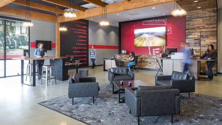
Take a look at Frontwave Credit Union.

Frontwave needed the efficiency to support high transaction volumes while creating a modern, conversational financial retail space. Teller pods support these high transaction volumes with the efficiency of a teller line, yet their configuration and openness create almost no barriers between members and staff. The same pods can support a Friday afternoon rush to cash a check or create a casual conversation setting to discuss a first mortgage. The layout of furniture and the tech bar give members visual cues for queuing.
Lines of sight are open and staff and members are free to move throughout the branch, yet it’s immediately clear where to go and where to line up during a rush.
Without any extra cost, Frontwave effectively manages the flow of traffic through a branch without cattle ropes.
Build Purpose-Driven Branches
Cattle ropes and other holdovers from previous generations of branches are the result of building a branch for the sake of building a branch.
Instead, credit unions need to be designing branches to fulfill a purpose.
A great branch design starts with alignment and charette sessions to uncover the “why” behind the design and establish a driving purpose for the branch, and every feature of the design needs to drive that purpose forward.
To learn more about the process, check out our Learn the Process series. (Read “Alignment Session” and “Design Charette” in particular!)


