Picture this. You’re standing in what looks like an endless line at your credit union during your lunch break. It’s dusty and dark. The posters are outdated. Chicago’s“If You Leave Me Now”is playing in the background. You can see that only one teller is working and she's in no hurry. It’s been almost 45-minutes and you’ve barely moved. You step out of line to fill out your deposit slip with the pen chained to the desk. Then, as you get back in line, you hear, “Next”, but you head for the exit instead. As you're walking out, you hear the faint sound of Chicago playing in the distance...“Baby, please don’t go. You’ll take away the biggest part of me”.But, you know it’s time.
A problem some credit unions have is outdated services and mobile apps that are lacking key features and are just "blah". They don’t realize small, simple changes can bring their services up-to-date and dramatically increase ROI. So, let's take a look.

Logix - Smarter Banking: It's Convenient Banking that's Connecting with Members
If you haven’t heard about Logix Federal Credit Union, founded in 1937, they’re located in California and transforming the digital member experience. From engaging online and brick-and-mortar customers to making banking convenient, friendly and positive experiences, here are a few takeaways if you're interested in digital transformation for your mobile apps.
Background Information
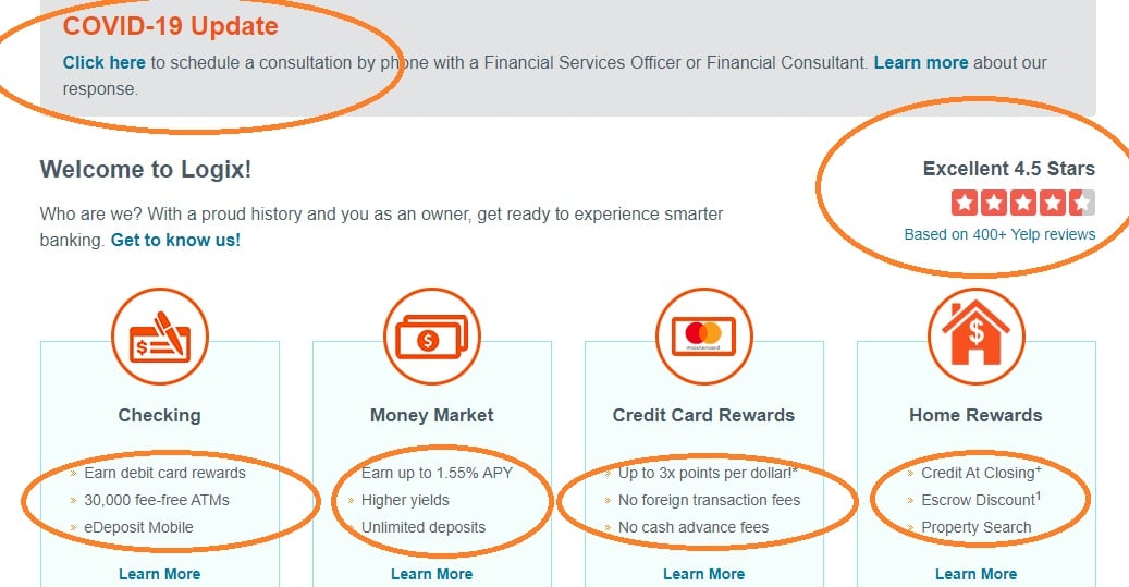
With 400+ positive Yelp reviews, Logix is ranked 4.5 stars. Customers LOVE them and are VERY receptive to their brand.
A few key points about Logix:
- As ofMarch 20, 2020, Logix FCU had $6.29 billion in assets, $1.76 billion in loans and a 15.98 net worth ratio
- Increased it’s member base by 89% and Forbes Magazine named them Number One Credit Union in California
- The credit union has just over 207,000 members, 740 full-time staff and 4 part-time staff.
- Logix is open online 24-hours and accessible from smartphones, tablets and computers.
What distinguishes Logix from other credit unions are the new technologies they implemented to reach younger audiences (millennials, online members). The Logix app includes a clean, easy-to-navigate, user-friendly interface and it integrates across mobile. Logix has a strong presence online and on social media.
So, what is it that Logix is doing that you can benefit from? Let’s take a look.
Data Analytics, Marketing and Promotions
“We already have a really great member experience, especially in our branches, and so we're driven by wanting to make our members feel welcomed, significant, and engaged. What we're trying to do is take that feeling and replicate it across other channels: on our website, within online banking, and throughout our mobile app.” Anna Fonseca, CEO, Logix
Data Analytics
To stay on top of digital banking changes, Logix implemented a new business intelligence and data analytics department. This department is crucial to gathering key insights and useful data on members and staff. The data is shared with artificial intelligence (AI) and machine learning products that can provide special reporting on specific member behaviors. Hence, all that new technology can help Logix harness data they need to improve user experiences. But, it doesn't stop there.
Marketing and Promotions
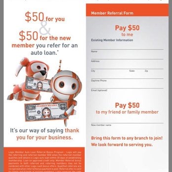
Logix is personable and convenient. Logix uses a tiny robot named Robix. He's displayed on various landing pages and might be driving a car to promote auto loans or holding up a heart around Valentine's Day. Hence,ads make members smile while highlighting added savings and marketing is attractive. Logix clearly identifies with members.
Promotions, marketing and other convenient features include:
- Promotions that identify with families and communities likeName the Logix RobotandDecorate your Halloween pumpkin like the Logix robot
- Offers customers can't refuse (to increase conversions) likeOpen a new account and receive $150,$50 for Auto Loan Referrals and Get up to $2,000
- No surcharge fees at their 30,000 ATMs and overdraft protection with courtesy pay
- Financial education to learn about money management skills
- Risk-based, auto, participation and indirect loans
- Convenient loan and savings calculators,e-statements, remote deposit captures and mobile payments
Landing Pages, Images, CTAs and Colors
Logix has a clean interface on their landing pages. The background isn’t harsh and the soft orange color is inviting. They also limit the amount of text with each ad. Logix uses the appropriate font sizes and large call-to-action (CTA) buttons to help members navigate pages.
Images are consistent with their brand and usually only include the Logix robot and bold colors that display ads. Some pages include reviews and feedback with large images to help members feel confident when accessing the site.
For credit unions that want to take a similar approach, Neil Patel suggests:
Use customer reviews to show transparency…
About92% of consumersread reviews before making a purchase. Neil says to put testimonialseverywhere, not just on a dedicated page that members may have trouble accessing.
Support customers - Even in hard times…
The COVID-19 update (above) lets members know the credit union is there to assist them. And, they can click on a simple link to find support and financial services (without having to come to a branch and stand in line).
Limit information on the screen display area...
Instead of lengthy applications, limit what’s shown. Remember, membersare busy and they’re banking from their phones. A few CTA buttons can make it easier for them to get the information they need.
Other ways to clean up your app include removing carousel banner ads. Clark's shoe company did this after their A/B test and increased conversions by17.5%while bounce rates fell 16%.
Include high-quality images…
As more people are online, they can choose where to shop and bank. Make your app visually appealing to them. Website design drives about94% of traffic.Clean images can also reduce bounce rates - so always check your analytics.
Next, don’t be afraid to pay more for staged images instead of generic stock images that people have seen before. Increasing your authenticity can improve your brand. Take a look at Logix’s image below forAdvice and Planning. Again, the images are large and clear while the text is minimal.
Limit landing page lengths (enough scrolling already!)...
Creating a longer landing page doesn’t always mean consumers will stay on the page. It might confuse them if all you’re asking for is an email address, for example. Keep the content simple for better results.
To test this, monitor your email signup page, a CTR to your blog page and a visits services page. Consider a company likeMarketofor marketing automation. They provide short-form templates to reduce unnecessary scrolling.
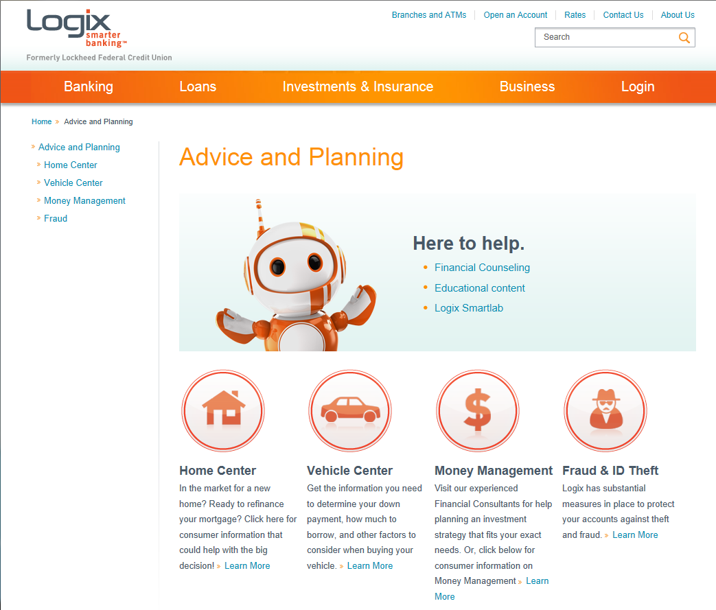
Banking and Loan Products, Education Center and Online Support
Another area where Logix makes banking convenient is with its education center, shown above asAdvice and Planning. And, for credit unions this is important.
Your education center is a self-help area where members and applicants can have their questions answered. If youdon’t have an education center or knowledge base, consider setting one up for your app. It might include YouTube videos, help topics, common questions, top articles, blog posts and tutorials about products and services.
Check outHubspot’s resource centerand knowledge base options to personalize your pages and make them engaging.
A few additional tips:
- Make it easy for customers/members to find solutions to routinely asked questions.
- Include a search bar option for questions not immediately viewable.
- Include chat and text options that can work with machine learning and AI. This should be available 24-hours a day. You can automate this feature through your software and it will free up humans so they can help members who come into your brick-and-mortar locations.
- Keep your content fresh, relevant and minimal.
- Monitor searches with Google Analytics. You’ll know the topics you’re missing and can make the necessary changes.
- Optimize your loan origination app across mobile devices. Instead of taking a website and trying to convert it into a mobile app, start a new app that’s optimized for mobile devices and social media.

Make Your Mobile Banking App Convenient . . . And, Customers Will Spread the Word
When you set up your lending suite of services, if you’re finding that there are features you’re missing, consider upgrading your loan origination software. Loan origination system software likeSync 1provides credit unions with smartphone integration to increase membership and lending (auto loans). Members can access the best rates in real-time and make informed loan decisions. Here's how they helpedNeighbors Federal Credit Unionin Baton Rouge.
Ultimately, as consumers are accustomed to shopping instantly and conveniently from their smartphones, they want to bank the same way. Hence, your mobile app shouldn't lag behind. Optimize your app with clean images, big CTA buttons, loan calculators and account features.With digital mobile app solutions that include automation, AI, and other tech advances, banking is becoming not just smarter but more convenient. As Logix’s CIO Eduard Chuang pointed out,“We truly aim to provide the best possible banking experience that our members can have.”And, when members are happy, they’ll access more features confidently and will share their experiences with others. And, that's a win-win for everyone. Well, Domo arigato Mr. Roboto!


