If you categorize website functionality using the crawl, walk, run framework, the types of features that fit into each of those stages have changed significantly in the last handful of years. While strategically placed call-to-action buttons in the latest 'must-click' color and mobile responsiveness were considered "run" stage features not too long ago, they're now "walk" level functions at best.
At this point in the digital evolution of online banking, your CU website should be working harder for you, offering far more value than simply looking good on a mobile device.
Your institution’s website needs to be an agile digital asset that delivers a unique, individualized, value-added experience for each of your members or potential new members. If it’s not your largest fully functioning branch, top sales producer, and the premier face of your credit union you should consider these three areas for improvement.
1. Online Account Opening and Loan Applications
It's probably no surprise this is the first item on the list. Today's consumer considers mobile friendly online applications a basic standard, not a “cool” new feature. Mobile applications are now a ‘walk’ stage website must-have, not a fancy feature people are willing to live without if necessary.
If your website still doesn't offer online applications, you're very much still in the ‘crawl stage’ of website functionality. It’s time to prioritize these upgrades ASAP.
Keeping your online applications front and center is also important. If you have more than one vendor for your applications, keep them organized in your mega menu, making the option to ‘Open an Account’ or ‘Apply for a Loan’ the first choice in the menu dropdown for each line of business.
If you’re severely limited by third-party technology and stipulations from contracts signed years ago, aim for some simple quick wins with your vendor to ensure your application works well on mobile devices. If they can't handle basic requests to remove friction in the application process across devices, it may be time for a new vendor.
2. Dynamic Content
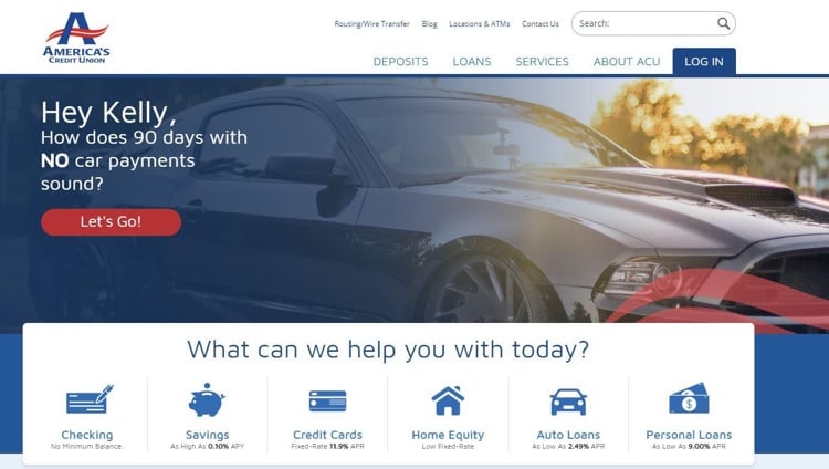
In a 2019 redesign of their website, America’s Credit Union integrated multiple pieces of dynamic content on their homepage. Not only does the homepage hero image and text change based on the user’s known details and past visits to the website, other modules change based on information the credit union already has about the visitor.
For example, if a visitor recently visited the Credit Card page, they’ll see a homepage banner with the same graphic from the Credit Card page and an enticing banner text if they revisit the site within a week.
And, if you’re in their contact database and haven't been on a key product page recently, they'll be sure to grab your attention with a personalized banner for their most recent product promotion.

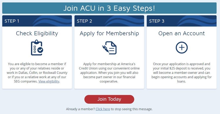
Beyond the homepage hero customization, ACU also changes the on-page modules based on membership status and other variables. For example, a non-member will see this module right below the homepage banner:

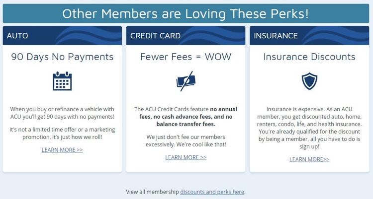
While a member will instead see the following content:

Through individualized messaging and graphics, ACU’s website is working 24/7 to deepen relationships by offering relevant, personalized, and timely information to visitors. This level of customization is also becoming the new norm. If your site doesn’t offer custom content, there’s no time like the present to get cracking on those new features.
3. Dynamic Campaigns Driven by User Behavior
Staying with the America’s Credit Union example, their website is also running automated marketing campaigns to every contact in their CRM (customer relationship management) tool based on website behavior. The contact receives an email within 20 minutes of a site visit about the product or service page they just visited. These emails are restricted to one per product, per week, and can never be sent twice for the same product line to ensure they maintain a pleasant experience.
There may have been a time people considered this behavior to be "creepy" or "stalkerish," but today's consumer expects it. ACU has experienced a 37.5% open rate and a 25% click through rate with the emails they send after a contact visits their Auto Loan page. Furthermore, there have been 0 unsubscribes and 0 SPAM reports from this email!
Your website should be working in conjunction with a robust CRM tool to deliver value-added messagingthat builds trust and deepens relationships. Having your website and CRM on the same software platform helps significantly.
There are many, many other elements to building an agile website. Be mindful that one function that should be considered a standard across all sites is ADA compliance.
If you're building a new website in the near future, go beyond the ‘crawl’ stage of building an aesthetically pleasing desktop page that scales well on mobile. Build at least a ‘walk’ stage agile site that meets todays consumer’s basic expectations.
Want to discover more about how to keep your digital efforts current? Visit the FI GROW Blog today. We can also help you through any website redesign so feel free to visit our website to learn more about how we can help!


