Here are seven key features that should be a part of every credit union website.
- SMART Content is a MUST on Any Credit Union Website
One of the biggest trends in online shopping is the expectation by consumers that their experience will be personalized to their specific interests and needs. People might not realize this, but personalization is everywhere and it’s not going away. This is why credit unions need to be in this game with website content. A robust content management system (CMS) will allow your marketing department to customize what individual users see based on known characteristics or recent digital behavior, and this kind of SMART content is an absolute MUST for any successful credit union website.
For example, if someone has recently visited your website and is a known member, you might want to show them a specific rate promotion for a product they don’t already have. Or if they are not a known member, but have been on your mortgage page, why not show them mortgage content the next time they visit your homepage.
Gone are the days when a homepage rotating banner was all you needed to vary the content on your website. Instead of randomly rotating content use digital behavior and known member information to actually show them information that might be more interesting to them.
- Lead Capture Should Be on All Website Pages, Including Product Pages
In today’s digital world, consumers are spending more and more time online researching products and services before they ever reach out to a business for more information. But there are ways to take advantage of this increased online traffic and still capture leads for your sales team to follow-up with.
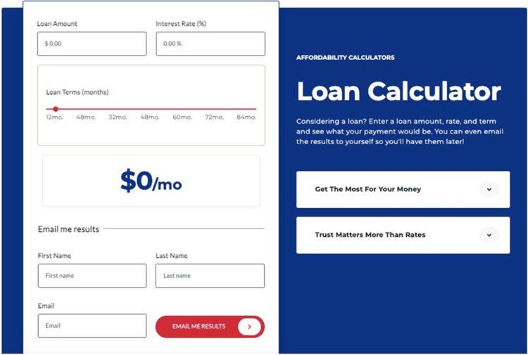
We recommend that all credit unions have some form of lead capture on EVERY page of their website in addition to any Apply Now types of calls to action. Lead capture opportunities can include payment calculators that offer to send results to users via email, downloadables like eBooks or checklists, or contact us forms that are specific to the product or service on the page that ask for more qualifying information for sales follow up.
Keep in mind that not all visitors to your website are ready to Apply Now which is why it’s so important to have a secondary call to action or lead capture. We also recommend payment calculators with email me results as a great way to capture leads when people are ready to learn more or possibly hear from a lending specialist. Here’s an example below:

This way you can collect contact details for people who might be in the middle of their buying journey and then nurture them further in hopes of bringing them back to Apply Now when they are ready.
- Create a Robust Resource Center for Your Credit Union's Website
In recent digital branch builds we have added a nice feature to several credit union websites that would be nice to see more widely adopted. A resource center is a nice way to summarize all the various kinds of content your credit union is creating and organize it in one place for ease of access. We recommend having a way for people to select the topic they are interested in learning more about as well as the type of content they would like displayed.
Below you see the resource center for Copper State Credit Union in Phoenix, Arizona.


There are featured pieces of content that can be set at the top of this page and then a section where you can select topics and type of content you’d like to see displayed. It’s interactive and efficient.
- Live Chat and Chatbot (And Video Banking, If At All Possible)
The need for live chat support on websites has been growing for some time, and Covid has only increased the interest in online support. Credit unions have not escaped this important and increasing consumer demand. People simply expect that if they can’t find an answer quickly on your website there will be a fast and easy way to get more assistance. And that comes with robust live chat and a chatbot.
If set up properly, a well-designed and continually updated chatbot can actually reduce the amount of inquiries fielded by your call center and branch staff members. Furthermore, you can track the popularity of topics viewed to better understand what users are looking for and use this information to update your website, chat support, and better train your live call center team. And if you don’t have a call center then reducing unnecessary calls to your branch staff will be a huge time saving benefit from implementing a chatbot.
We also recommend working toward implanting video banking on your digital branch/website. Again this feature is more in demand than ever, and offers a personalized way for people to learn more about your products and services. People are going into branches less and less, and for this reason, being able to continue to interact with them in a face-to-face manner, even online, should be a goal of every credit union.
- Integrated CRM to Kick-Off Sales Automation Based on Real-Time Digital Interactions
Your website is no longer a glorified digital brochure. Rather it should be your highest performing branch, open 24/7, and be an optimized lead generating machine. But, if your marketing team is driving leads in the door, it’s only logical that the next step is to connect those leads with sales follow up, and the only effective way to do this is via automated nurture and a sales team with a robust and connected Customer Relationship Management (CRM) tool.
Some website platforms not only provide an amazingly user friendly Content Management System (CMS) to maintain your website content, but also include a built in CRM. This feature allows you to track the digital behavior of a user and provide them with personalized content on the site, as well as behavior triggered sales follow up if a known user takes a specific action you have deemed key in their buying journey.
For example, if you have a known member who is on your website checking out content around auto loans or mortgages we would recommend that within 20-30 minutes you send that individual an email with more information. These follow ups are timely and relevant to the user, and we have found them to be by far our best performing marketing emails. The messaging should be education and helpful, offering additional information or resources, while also mentioned any special rates or promotions. All with the goal of nurturing that consumer back to your website to Apply Now.
Without a great system in place to host and operate your website, this kind of marketing nurture isn’t possible. So, make sure you select wisely when evaluating your next website redesign options.
- Rates Tables on Product Pages Rather than on Rates Pages
Many credit unions still have huge rates pages that basically list every rate available for their products. Then this page is linked from product pages for access to the information, but the actual rates are not available right on the product pages themselves. This should be avoided for a few reasons.
First, you are giving competitors easy access to your entire rate sheet, which makes it easier for them to compete with your offerings. Second, you are adding a click to the consumer’s buying experience and taking them away from the page that typically offers the most information about the product and will drive a user to apply online.
Finally, you’re not including rates in a meaningful and authentic manner on other pages of your website. Often rates pages are done to limit the number of places rates need to be updated when they change. But with a good CMS you should be able to handle rates in a more efficient manner. Your system should allow you to update rates in one place in the backend of your website and have those changes populate throughout your website. If your CMS doesn’t do this, and your web developer can’t build you a better way to update rates, you should consider a different solution altogether.
- FAQs Answered by Real Customer Testimonials
Recently we’ve seen a rather creative way to answer FAQs on a credit union’s website. Typically, we suggest accordion styled FAQs that pop open when clicked. These must be designed for ADA compliance and offer all the basic information a consumer might be looking for. Working with your frontline staff and call center team to identify your FAQs is the easiest way to generate this content, and it can also be used in your chatbot.
But presenting the answers to these questions is where you might consider getting a little more creative. Why not find actual customer testimonials that address some of your FAQs and use those in place of just a basic answer.
So if someone asks how long the mortgage process takes from start to finish, why not ask a member to answer this for you? They could say something like ‘working with XYZ Credit Union was easy and efficient. The entire process took about 45 days and was so much less stressful than I was expecting.” Generating these kinds of answers might take a little more time, but they are so much more impactful when read by potential new members.
We hope you’ve found some good value in our list of website must-have features, and we’d be happy to work with your credit unions on your next website redesign project. Feel free to contact FI GROW today to learn more about how our team can help your credit union grow!


