It’s Wednesday evening and Amy is sitting in the parking lot of her son's Little League practice while perusing Instagram when she remembers she wanted to search for home loan options. She’s got 20 minutes before practice ends so she pulls her credit union’s website on her phone.
Amy scrolls, trying to decide if they should buy or remodel, looking through loan options, the current rates and a blog article about home improvements that increase value. Happy with the information she was looking for to help make a decision for her family, Amy returns to Instagram and clicks on her favorite home décor account for inspiration less than ten minutes later.
As a user experience researcher, I have spent time with dozens of people like Amy. I sat with them as they tried to navigate websites, listened to their frustrations and reviewed their feedback. Ultimately, we interview many people who use the website and while they may have different goals and frustrations than Amy, it all boils down to wanting the same thing — ease of use. An easy-to-use website means they can find what they’re looking for quickly and seamlessly and get on with their lives. My job is to advocate for visitors at every stage of a website project to ensure that their goals and priorities are top-of-mind when it comes to structure and design.
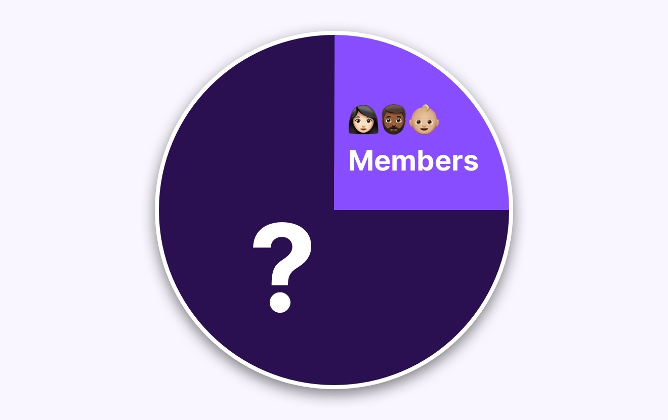
So, how can you help create a seamless experience for your members, whether they're small business owners balancing their books late at night or moms pursuing home loan options from a parking lot? Here are five insights that rise to the top of our research findings for financial institutions of all sizes.
1. Easy-to-find rates: When members search for investments or loans, rates need to be easily found and accurate. However, accomplishing that task can take time for credit unions and the teams who manage the website. For your web team, displaying rates in tables on a single page is the easiest way to ensure accuracy. But there are better ways for users to find the information. If all of your loan rates are displayed on a single page—or worse, in a PDF—your members have to scroll through loan rates of all kinds to find the rates they are looking for. People want information and they want it fast, especially when it relates to their finances and financing.
Instead of manually updating your rates on every single page, ask your web developer to add a centralized module to create and manage rates in a single place. This will help your web team maintain accuracy while also making rates easy to find on your website giving members access to the information they were searching for quickly.
2. A search feature that works: One of the biggest pain points I consistently hear when listening to feedback about credit union’s websites is that members have a hard time finding information when using the search feature. When a member tries to search for auto loan rates the results force them to wade through results that include press releases, blog articles or even a photo gallery from a community event five years ago. When this happens, members go from zero to frustrated fast. They will exit from your website and call their nearest branch or customer service for help instead.
Test your website search by taking it for a spin. Do the results show you what you are looking for? If not, your members aren’t finding what they are looking for either. Optimizing your website search means happier members because they will be able to find information fast.
3. Intuitive navigation: Members often share their frustrations over not finding the information they’re looking for because the navigation fundamentally doesn’t make sense to them. A common reason for this is that the website structure and navigation terms reflect internal department structures. How to avoid this pitfall? Consider the person’s journey when visiting your website and challenge yourself to think outside of your organizational priorities and structures and use terms familiar to your members.
You can also conduct user testing to ensure your naming conventions make sense to members and that they find what they are looking for. Test the navigation before and after the website updates to ensure that you’re truly making it easier for members to navigate your website.
4. Create a resource hub: Help reduce calls and quickly answer your members’ commonly asked questions by creating a dedicated FAQ or Help Center section of your website. Some Information you can include in a Help Center includes
- Routing number
- How-to documents for mobile apps and setting up digital wallets
- Resources for small businesses
- Loan calculators
- Checklists for opening accounts
Organizing these topics and questions in one spot can have a big impact on the usability of your website.
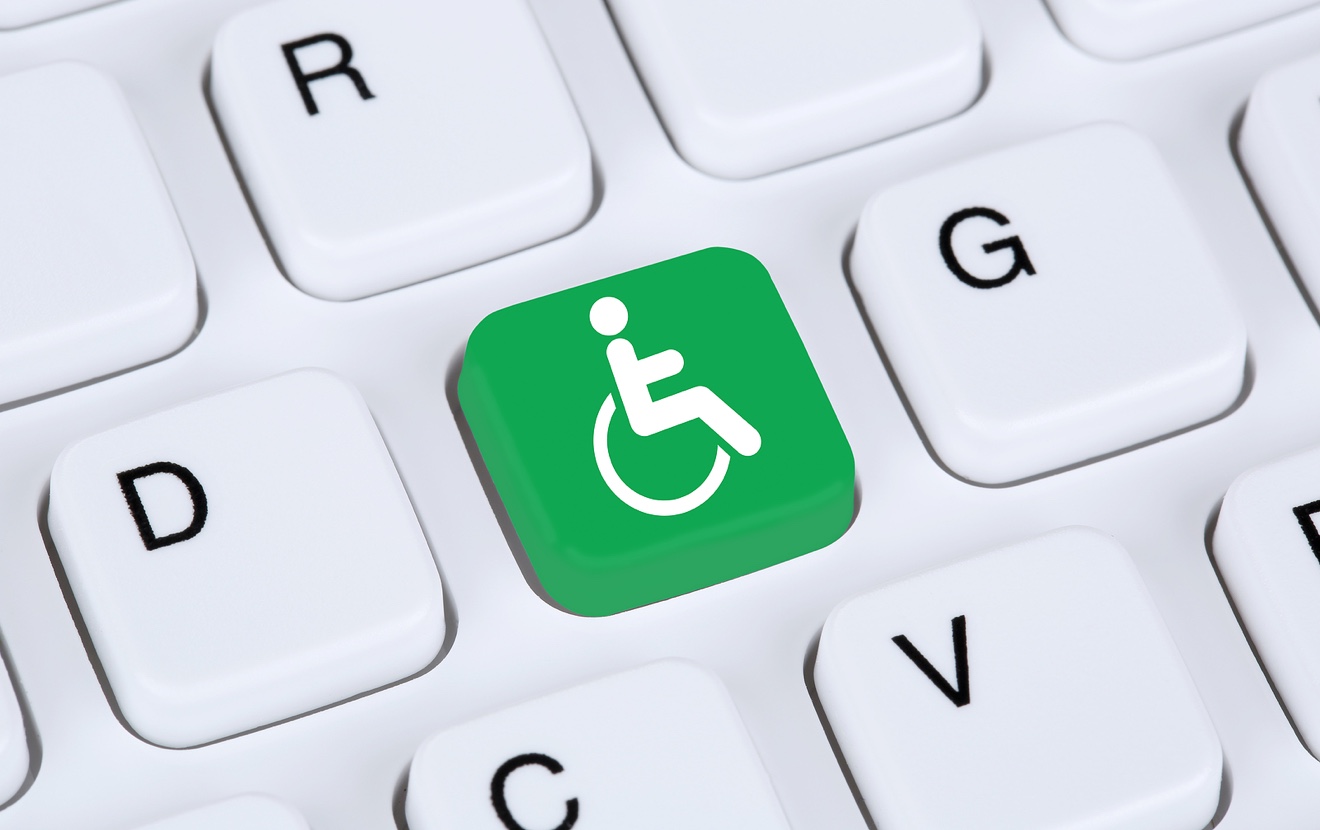
5. Keep accessibility top of mind: Approximately 61 million people in theUnited States live with a disability. That’s 1 in 4 adults. Designing for accessibility isn’t just about mitigating legal risk for your credit union, it’s about building a better web that is inclusive for all. Whether you’re creating a new website or redesigning your current one, here are some things to keep in mind to ensure people with assistive technology can access your website
- Make sure all content is easily accessible
- Add alt text to all images
- Choose colors carefully
- Use headers to structure your content correctly
- Design forms for accessibility
- Enable resizable text that doesn’t break the website
- Avoid automatic media and navigation
Invest in your website
Credit unions are special because they serve communities where people live, work and play. Your website, or online branch, should reaffirm the sense of community and build trust by providing a seamless, user-friendly experience for your members. Create a website that meets the diverse needs of your members by incorporating easy-to-find rates, effective search features, intuitive navigation, a comprehensive resource hub, and accessibility top of mind.
Investing in these improvements not only benefits your members but also supports your credit union’s mission to serve the community effectively. By prioritizing user experience, you ensure that your website is a helpful and welcoming resource for everyone it serves.
About our experience
SiteCrafting is a full-service digital agency with 26 years of experience researching, designing and developing websites for clients. Our User Experience team, which specializes in research, usability testing and interaction design, has tested hundreds of websites and continuously works to improve the experience for users and those who manage websites throughout the website redesign process. Learn how we help make the web better for everyone and how we can help with your next project.