Unlike the Loch Ness Monster, Bigfoot, or a pack of snarling Yeti, the misconceptions people have about credit unions can do real harm. There are four myths in particular that dissuade people from banking with credit unions. As the number one touch point with your potential members, your credit union’s website is an ideal place to dispel these myths.
What are the myths?
In 2018, CUNA sponsored a detailed round of research—including focus groups, surveys, and other qualitative data—to get a better idea of how people perceived credit unions. They discovered four key barriers to membership: myths that keep people away from credit unions and stuck to big banks.
Myth #1: I can’t join
Why would someone bother with a credit union if they can’t become a member? Credit unions need to clear up eligibility confusion as early and prominently as possible. In our highly digital world, the most prominent place you can address this misconception is on your website. Adopt a welcoming tone and be immediately transparent. Your homepage is often the best place to start; and using personalization technology, you can deliver targeted messages to potential members.
When explaining your field of membership, use inclusive words. Phrases like “Anyone who…” or “Everyone who…” work well, as in “Anyone who works or lives in Delaware County can open an account with us.”
What if your eligibility requirements are complicated? This may require a little creativity. For example, OAS FCU’s website has a fun, interactive quiz right on the homepage to help people find out if they are eligible.
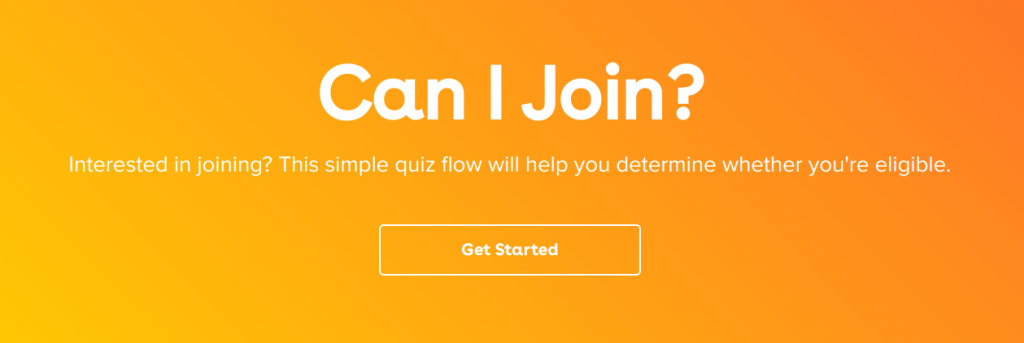
Eligibility quiz built for OAS FCU by an award-winning credit union website design agency
Solutions: Use welcoming language, be transparent about your field of membership, and make it easy to determine eligibility
Myth #2: Accessing my money may be hard
Most credit unions today have online and mobile banking options, but that doesn’t mean most Americans are aware. Feature these options prominently within your credit union website’s design. We suggest making it easy for members to log in to their accounts from any page. Furthermore, your site should be mobile-friendly, so people can see you’re with the times and can provide mobile access to their money.
As a credit union, you probably offer Shared Branches and ATMs through the CO-OP network. Don’t forget to advertise that! On SIU Credit Union’s website, there’s a tab on the contact page that’s dedicated to Shared Branches and ATMs, making it easy to learn more about the service.
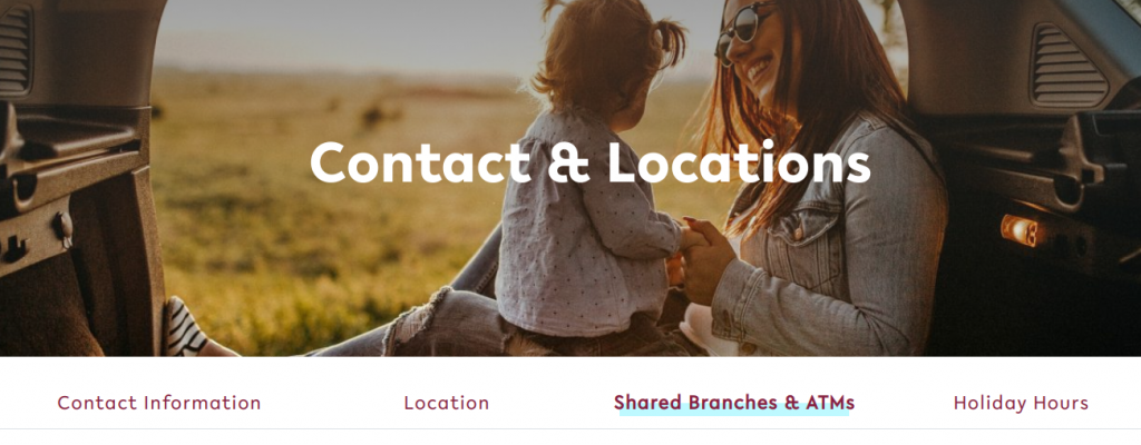
ATM locator tool on SIU Credit Union’s website, designed by BloomCU
Solution: Highlight online banking and mobile banking, as well as shared branches and ATMs
Myth #3: Credit unions are too small
Although the local, community feel of credit unions has its advantages, it can also make people nervous. One of the biggest ways you can appear trustworthy is to improve your credit union website design. Beautiful design shows you are a top-notch financial institution with substantial resources and not just a “mom and pop shop”.
Don’t be afraid to highlight stats in your messaging, especially if you’re a bigger credit union. People love social proof and respond well to it. In the example below, we did a “by the numbers” feature for OE Federal’s website, making the popularity of the credit union among union workers readily apparent.
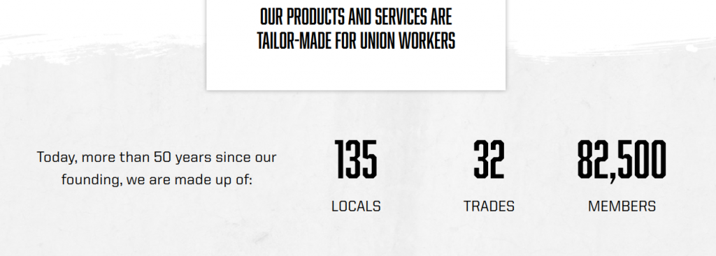
Stats featured on the homepage of OEFCU.org
Solutions: Invest in beautiful design and leverage social proof
Myth #4: They’re just for those in need
Although credit unions have fantastic rates and services, they aren’t specifically for those who need extra financial help. However, many Americans believe this myth.
Addressing it on your website takes some subtlety. You don’t want to alienate anyone, rich or poor, so make it clear that financial status is not a factor for eligibility. We recommend really focusing on high-quality, realistic photography to promote a diverse image that addresses the different groups in your area: people of varied gender, financial background, race, etc. Here’s an example of some of the different photography on Hoosier’s Hill’s website:
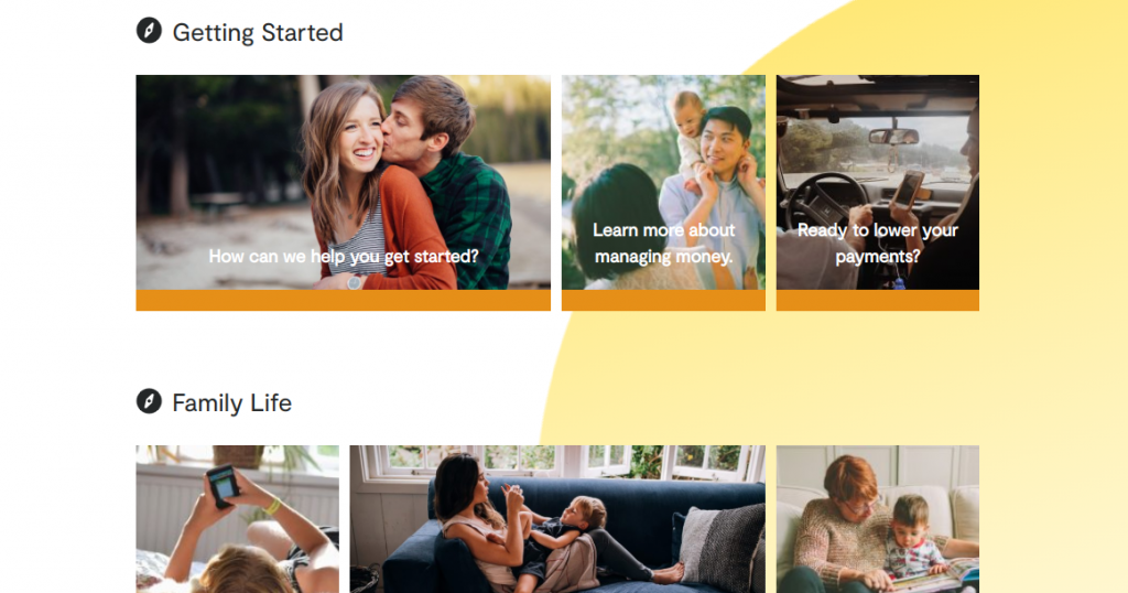 The right photography within your credit union website design can showcase the diversity of your membership base
Useful Resources for Photography:
How to select fantastic images for your credit union website
A guide to the best stock photos for credit union website design
Solutions: Use authentic photographs with real people in all stages of life